Portal - Dashboard
Once you have successfully logged into the portal, if you are a principal investor, it will automatically redirect you to the Dashboard .
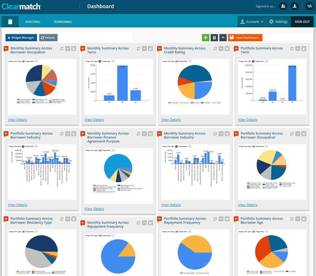
This dashboard is customisable and will allow you to choose which information you would like displayed on the screen which includes (but is not limited to) data in a graphical format (namely as a pie chart or bar graph), the latest transactions, reports, investments, etc:
If you are not at the dashboard, the easiest way to access it is by selecting the icon that resembles a clipboard in the top left-hand corner (next to the INVESTING menu) 
Outlined below are the different widgets that you can add to the dashboard with a brief description of what it will show and an example of data output:
- Monthly Summary Across Borrower Age - If you are setup as a principal investor, you can view the VOI (Value of Investments) against the age group of borrowers, for the month. e.g. 3.18% (or 997) of the value were for borrowers between the age of 21-30.
- Monthly Summary Across Borrower Finance Agreement Purpose - As a principal investor, you can view the VOI against the main purpose or reason for the loan request, for the month e.g 9.68% (or 3008) of the value were for borrowers who applied for a loan to help pay off credit cards or loans.
- Monthly Summary Across Borrower Industry - As a principal investor, you can view the VOI against the industry that the borrower works in, for the month e.g. 66.13% (or 20764) of the value were for borrowers who are involved in the Construction industry.
- Monthly Summary Across Borrower Occupation - As a principal investor, you can view the VOI against the occupation that the borrower works as, for the month e.g. 11.44% (or 3593) of the value were for borrowers who are self employed.
- Monthly Summary Across Borrower Residency Type - As a principal investor, you can view the VOI against the type of residency that the borrower has, for the month e.g. 7.41% (or 2327) of the value is for borrowers who are renting.
- Monthly Summary Across Borrower State - As a principal investor, you can view the VOI against the state that the borrower is based in, for the month e.g. 49.24% (or 15460) of the value relates to borrowers who are based in New South Wales.
- Monthly Summary Across Credit Rating - As a principal investor, you can view the VOI against the credit rating that has been selected by the borrower, for the month e.g. 0.32% (or 100) of the value are for borrowers with a credit rating of B.
- Monthly Summary Across Repayment Frequency - As a principal investor, you can view the VOI against the repayment frequency that has been selected by the borrower, for the month e.g. 52.41% (or 16454) of the value are for borrowers who prefer to make repayments for their loan on a fortnightly basis.
- Monthly Summary Across Term - As a principal investor, you can view the VOI against the term that has been selected by the borrower, for the month e.g. 1.91% (or 600) of the value are for borrowers that have opted for a 60 month term to pay their loan off by.
- Portfolio Summary Across Borrower Age - As a principal investor, you can view the VOI against the age group of borrowers, overall or across the range of investments e.g. 28.75% (or 954670) of the value are for borrowers between the age of 31-40.
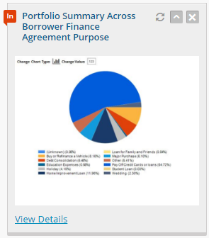
- Portfolio Summary Across Borrower Finance Agreement Purpose - As a principal investor, you can view the VOI against the main purpose or reason for the loan request, overall or across the range of investments e.g. 5.29% (or 175731) of the value are for borrowers that are using the loan for home improvements.
- Portfolio Summary Across Borrower Industry - As a principal investor, you can view the VOI against the industry that the borrower works in, overall or across the range of investments e.g. 12.55% (or 416595) of the value are for borrowers involved in the Healthcare or Social Assistance industry.
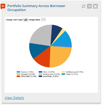
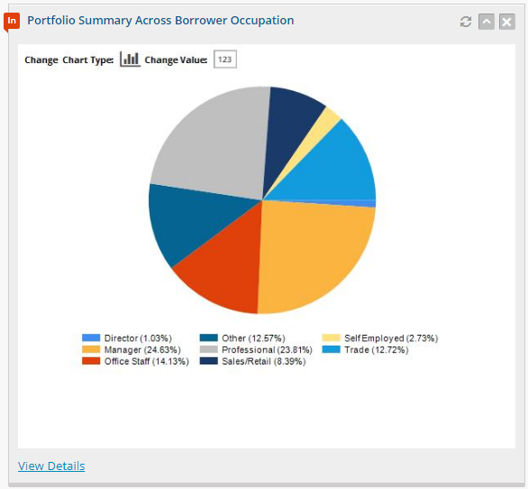
- Portfolio Summary Across Borrower Occupation - As a principal investor you can view the VOI against the occupation that the borrower works as, overall or across the range of investments e.g. 20.91% (or 694166) of the value are for borrowers who are Managers in their workplace.
- Portfolio Summary Across Borrower Residency Type - As a principal investor, you can view the VOI against the type of residency that the borrower has, overall or across the range of investments e.g. 11.38% (or 377969) of the value are for borrowers who are living with their parents.
- Portfolio Summary Access Borrower State - As a principal investor, you can view the VOI against the state that the borrower is based in, overall or across the range of investments e.g. 12.55% (or 416600) of the value are for borrowers who are based in Western Australia.
- Portfolio Summary Across Credit Rating - As a principal investor, you can view the VOI against the credit rating that has been selected by the borrower, overall or across the range of investments e.g. 12.04% (or 399681) of the value are for borrowers who have a credit rating of AA.
- Portfolio Summary Across Repayment Frequency - As a principal investor, you can view the VOI against the repayment frequency that has been selected by the borrower, overall or across the range of investments e.g. 20.63% (or 684899) of the value are for borrowers who have selected Monthly for their repayment frequency.
- Portfolio Summary Across Term - As a principal investor, you can view the VOI against the term that has been selected by the borrower, overall or across the range of investments e.g 2.75% .(91177) of the value are for borrowers who have selected the 24 month term to repay their loan by.
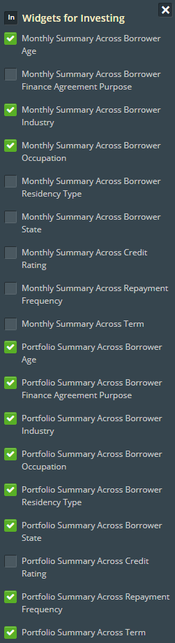
To add or remove a widget from the dashboard, click on the  button located just above the dashboard in the top left hand corner.
When this button is selected, it will then show a list of all available widgets to choose from, which can be enabled by clicking on the checkbox next to the widget name (until there is a visible tick in the box):
button located just above the dashboard in the top left hand corner.
When this button is selected, it will then show a list of all available widgets to choose from, which can be enabled by clicking on the checkbox next to the widget name (until there is a visible tick in the box):
After choosing which widgets you want to view, click on the  button to add the ones with a tickbox, to the dashboard NOTE: you can view the widget you have added while the widget manager menu remains open, which will allow you to check if it is the correct widget.
To remove the Widget Manager menu, click on the  button on the top right-hand corner or click anywhere on the dashboard.
To refresh the data displayed on the widgets, click on the  button located next to the Widget Manager button.
To make changes to the placement, size or details of the widgets on the dashboard, there are a series of buttons located in the top right-hand corner. 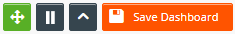
To allow the widgets to be moved manually, make sure the multi directional arrow icon  is green in colour. This will allow you to enable or disable widget sorting where you can move the widgets anywhere on the dashboard.
To lock the widgets in place to avoid them being moved, simply click on the multi directional arrow icon again and it will change from green to grey colour which is an immediate indication that the option is disabled
is green in colour. This will allow you to enable or disable widget sorting where you can move the widgets anywhere on the dashboard.
To lock the widgets in place to avoid them being moved, simply click on the multi directional arrow icon again and it will change from green to grey colour which is an immediate indication that the option is disabled 
If you want to view the widgets in a specific size, the icon with two lines  allows you to choose from small, medium and large.
The small option (icon with two lines), displays the pie graph sections, but you cannot see the legend. This is ideal if you have enabled all of the widgets from the Widget Manager and you want an overview of the data in a graph:
allows you to choose from small, medium and large.
The small option (icon with two lines), displays the pie graph sections, but you cannot see the legend. This is ideal if you have enabled all of the widgets from the Widget Manager and you want an overview of the data in a graph:
When the icon is selected again, the number of lines increases to three  which is medium and displays the widget in a slightly bigger format. The legend is more visible than the small option:
When the icon is selected again, the number of lines increases to four  which is large and displays the widget in a bigger (and readable) format. The pie sections and legend can be clearly seen:
The icon next to the graph size changer is a carat or up arrow  and will allow you to toggle the widget display. When it is set at this icon, you can see the graph associated with the widget showing under the title of the widget:

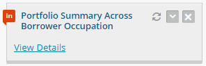
When the icon is selected again it will change the icon to a down arrow  and will not display the graph (only the title of the widget and the View Details link):
The Save Dashboard button will be orange in colour  but only if changes have been made to the dashboard and you would like to keep those changes.
Once it has been selected, it will change to grey in colour
but only if changes have been made to the dashboard and you would like to keep those changes.
Once it has been selected, it will change to grey in colour  to confirm that there are no pending changes on the dashboard that need to be saved.
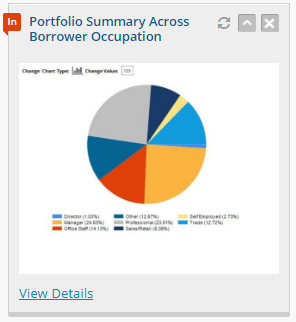
The graph(s) that have been added to the dashboard also have their own individual icons that can be selected to make changes to that selected widget (rather than across all widgets). These icons are located on the top right-hand corner of the widget:
To refresh the data for that individual widget select the  icon.
To toggle between the widget display for that individual widget, select the
icon.
To toggle between the widget display for that individual widget, select the  icon.
To close the widget and remove it from the dashboard, select the
icon.
To close the widget and remove it from the dashboard, select the  icon.
icon.
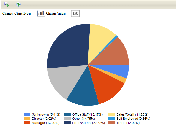
When the View Details link is selected at the very bottom of the widget, this will open an enlarged version of the graph (in order for you to clearly view the legend underneath). You can also change the graph from a pie chart to bar graph, change the data output to figures or dollar amount, or export the data to a format of your choice e.g. PDF, Excel, etc:

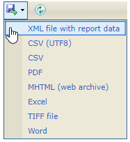
To export the data to a different format select the floppy disk icon  in the top left-hand corner.
This will then open a drop down menu with the various outputs that the data can be exported to (this is useful if you want to collate data or create specific reports):
To refresh the data of the widget that was selected, there is another  refresh icon next to the export icon.
To change the chart from a pie chart to bar graph, select the icon of the graph
refresh icon next to the export icon.
To change the chart from a pie chart to bar graph, select the icon of the graph  located directly above the graph and next to the Change Chart Type: option. This will allow you to see approximate figures that are associated with the data, in a bar graph format:

NOTE : when the graph icon is selected, you can see that the Change Chart Type: option has changed to the pie graph icon  as a means of showing you that it can be changed back from bar chart to pie graph.
To change the amount that is displayed (namely from the number as a value to a number as a dollar amount), select the
as a means of showing you that it can be changed back from bar chart to pie graph.
To change the amount that is displayed (namely from the number as a value to a number as a dollar amount), select the  icon next to the Change Value: option. This will display the data differently and the icon will change:
The legend amounts will change based on the information output. To change the value back to dollar amount select the  icon:
icon:

Related Articles
Portal - General Reports
There are specific summaries and reports that are available (that the investor can refer to), as a means of checking relevant information based on a given time frame. 1. On the portal, select the General Reports option under the Reports menu: 2. This ...Portal - Account Selection
In Clearmatch, you have the capability and flexibility to be configured as different users (borrower, investor, beneficiary, etc) and you can switch between accounts whilst in the portal and use the system depending on which account is selected. 1. ...Portal - Staff Member At An Originator (Broker) Creating An Application For Finance
Staff member have the capability to create an application on behalf of a customer through Portal. Then the staff member will need to supply all the details of the customer. 1. To create an application on behalf of a customer login to portal with ...Portal - Sign In (Mobile)
The portal in Clearmatch has the ability to allow you to login with your mobile phone number if a username and password has not been created . To find out more how to register from the portal and creating a new username and password, click here. ...Portal - Legal and Docs
On the portal, there is a menu option located on the left hand side called Legal and Docs that provides a list of all relevant documents that you have the choice to download and review or upload if/when required: The documents that are displayed or ...